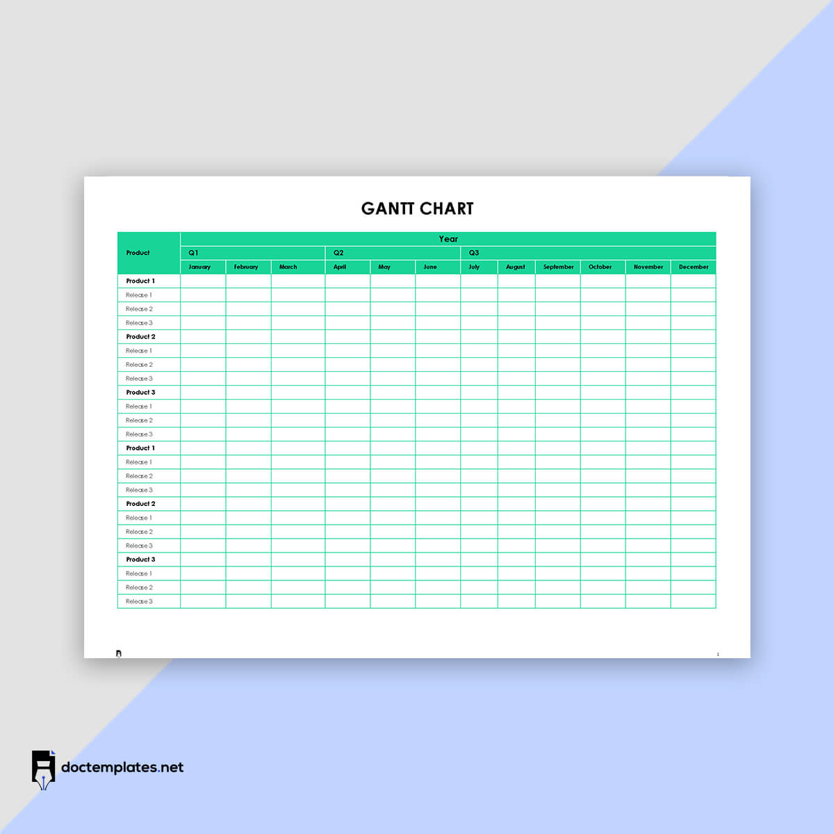
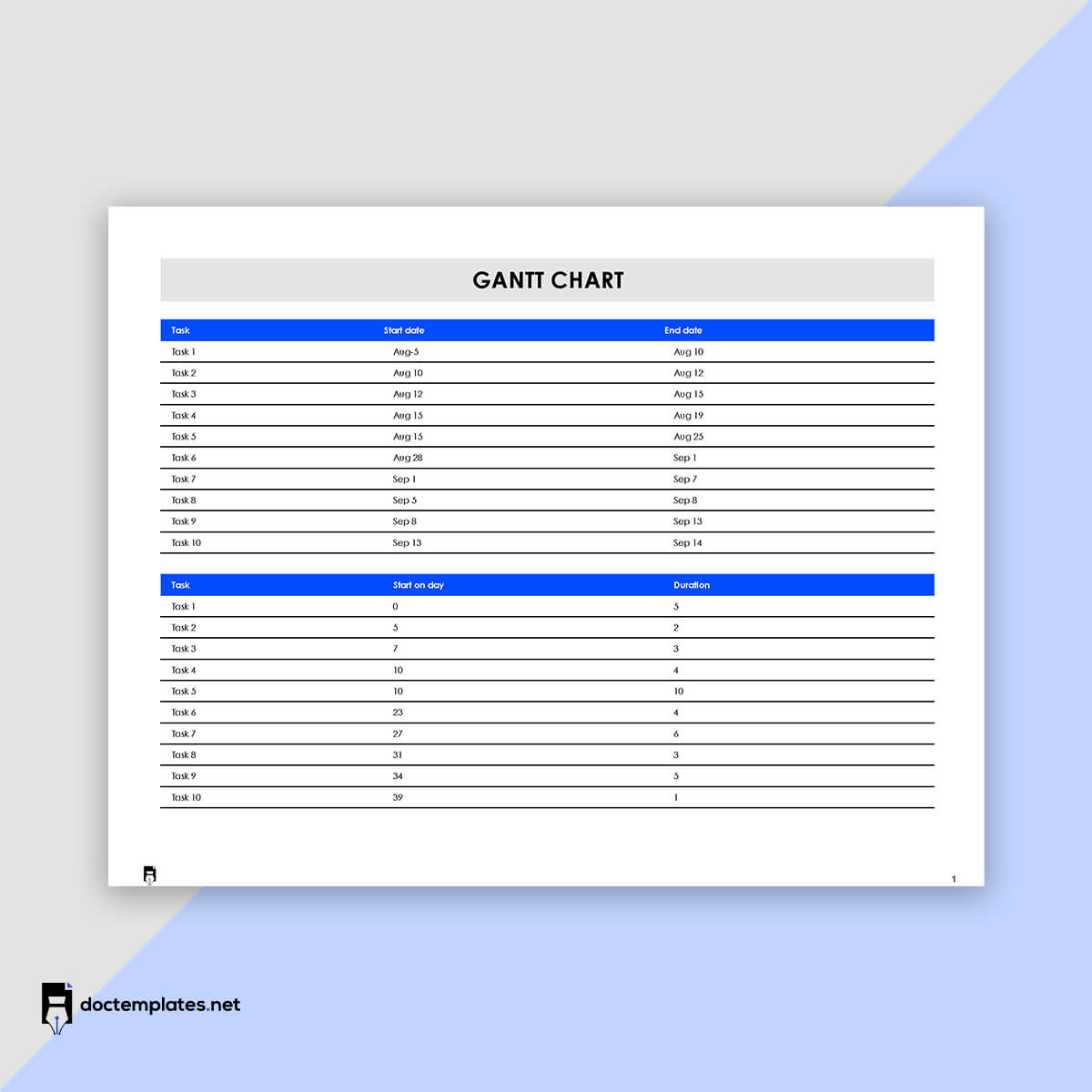
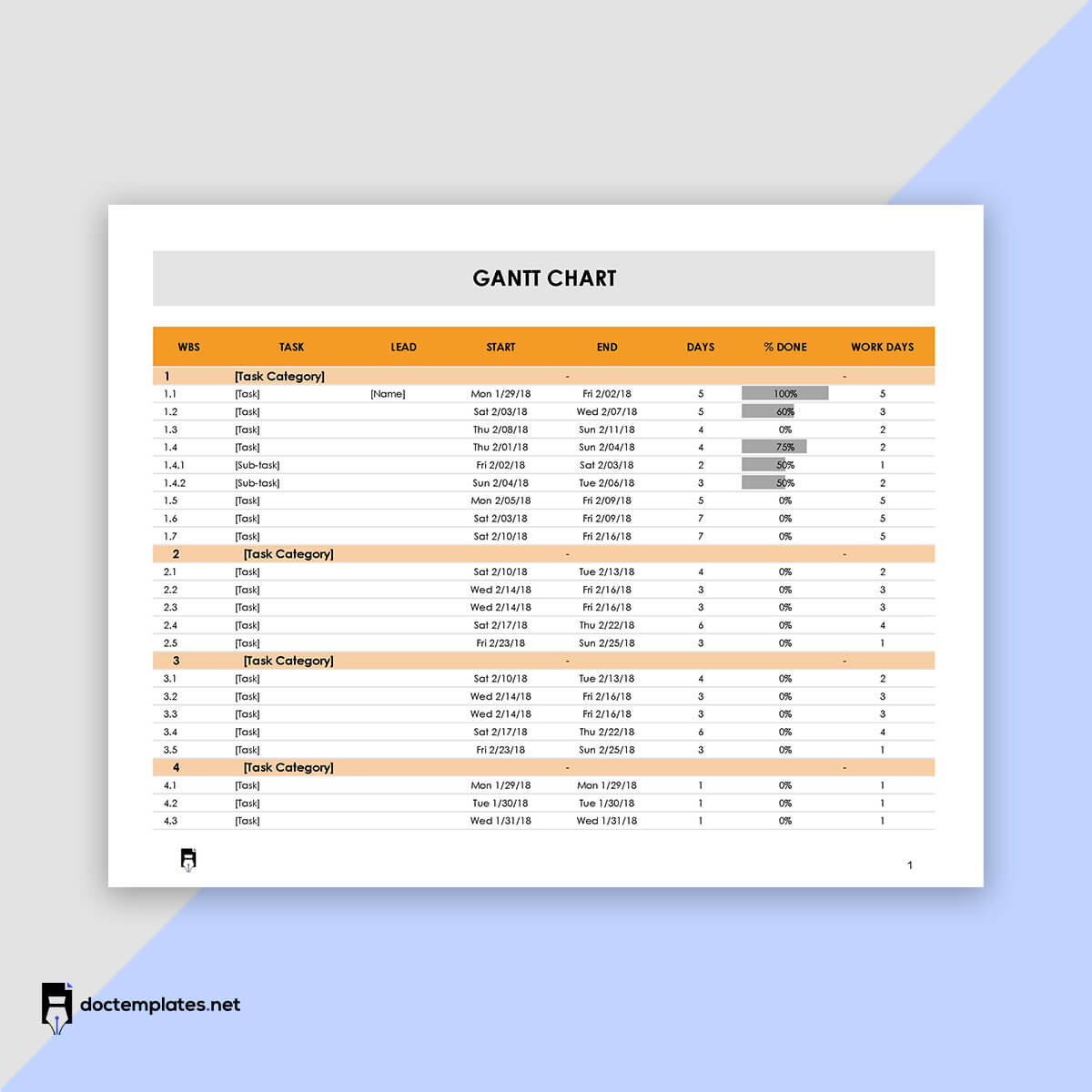
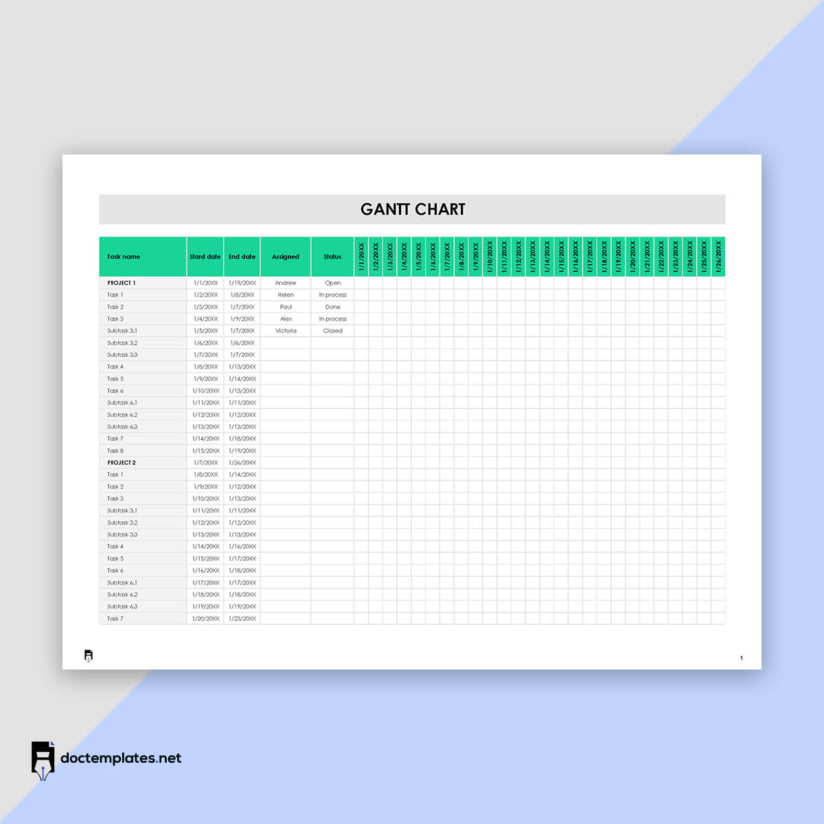
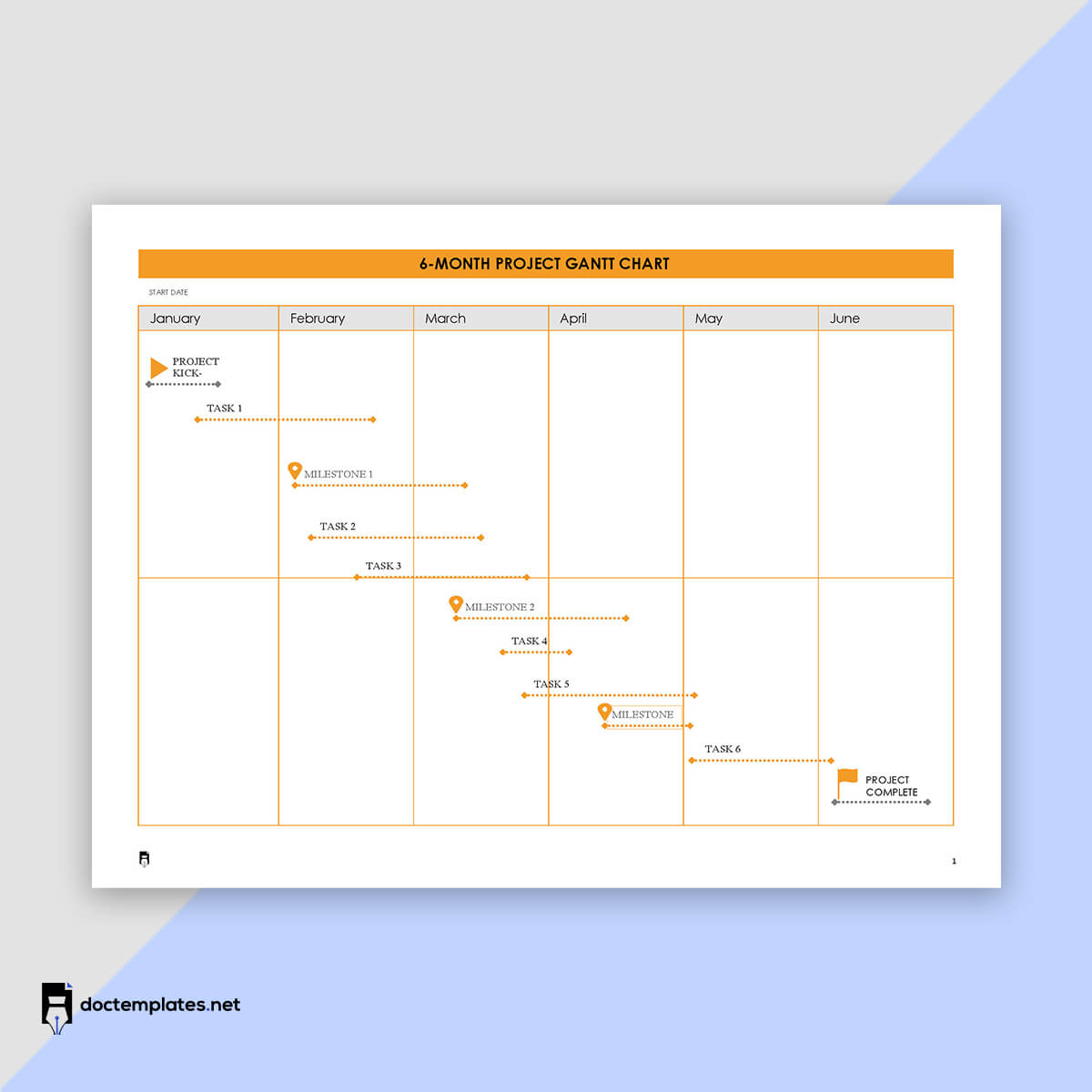
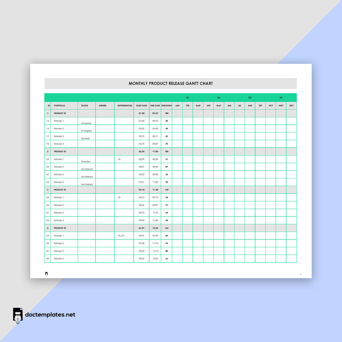
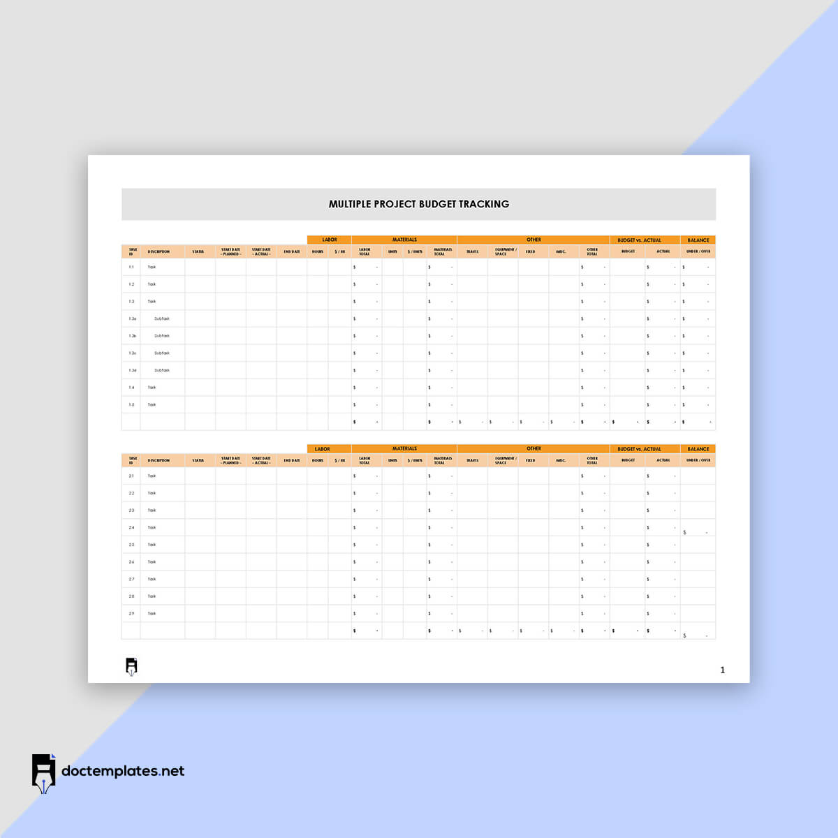
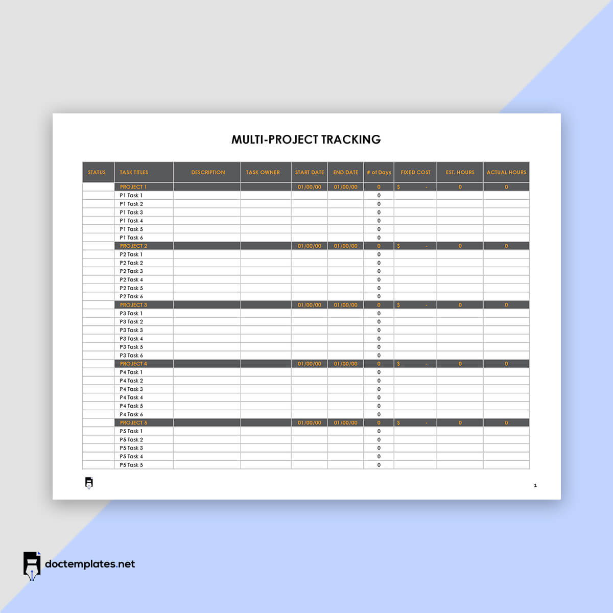
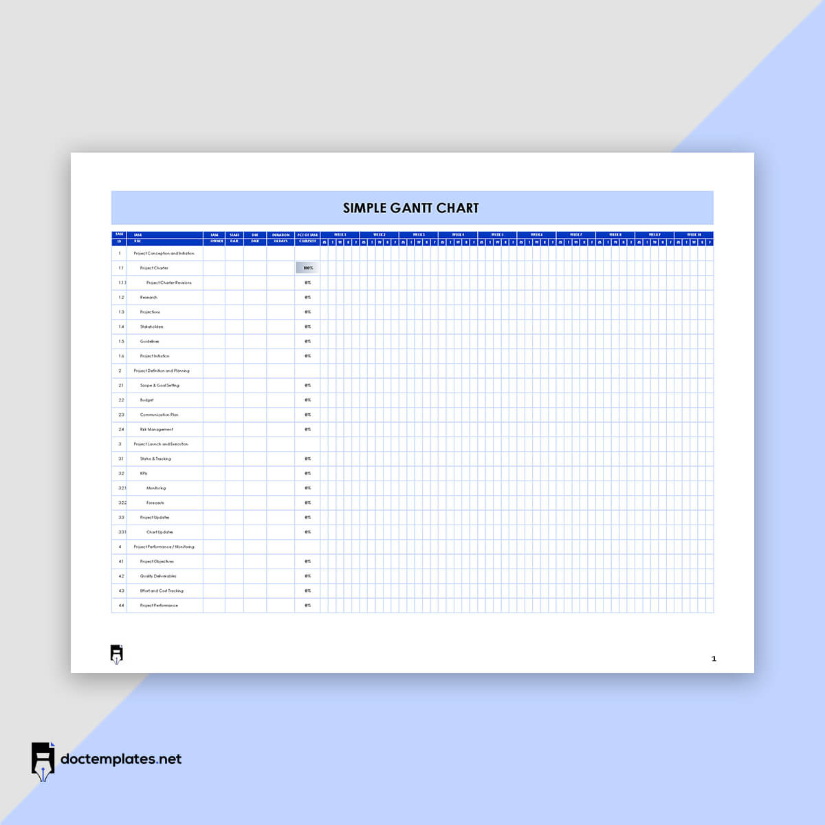
A lot of planning and management is needed to complete a job or project. Different project management tools like Gantt charts can be used for these functions. A chart is a visual tool that shows all the tasks undertaken in a project, their duration and dependencies, and the project schedule.
At the beginning of the project, the chart is used to plan how the project will be executed over time. However, the chart monitors the task statuses as the project is implemented. The charts are popular among project managers for projects like the construction of dams, bridges, highways, etc. Still, they can be utilized in any situation or job that requires adequate planning and organization, such as software development. With a chart in place, project management is simplified as you can view the progress of all the moving parts (tasks, assignees, deliverables, and resources) in one place. This prevents project bottlenecks and confusion.
This article will discuss how to create a Gantt chart and how it is used to manage a project.
Gantt Chart Templates
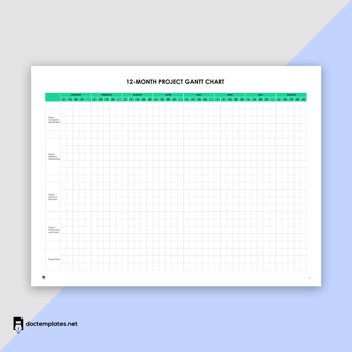
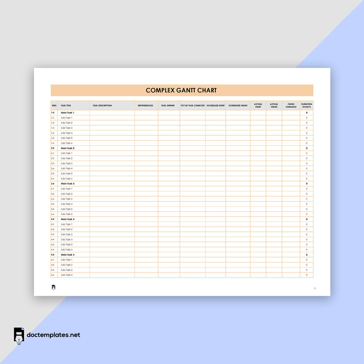
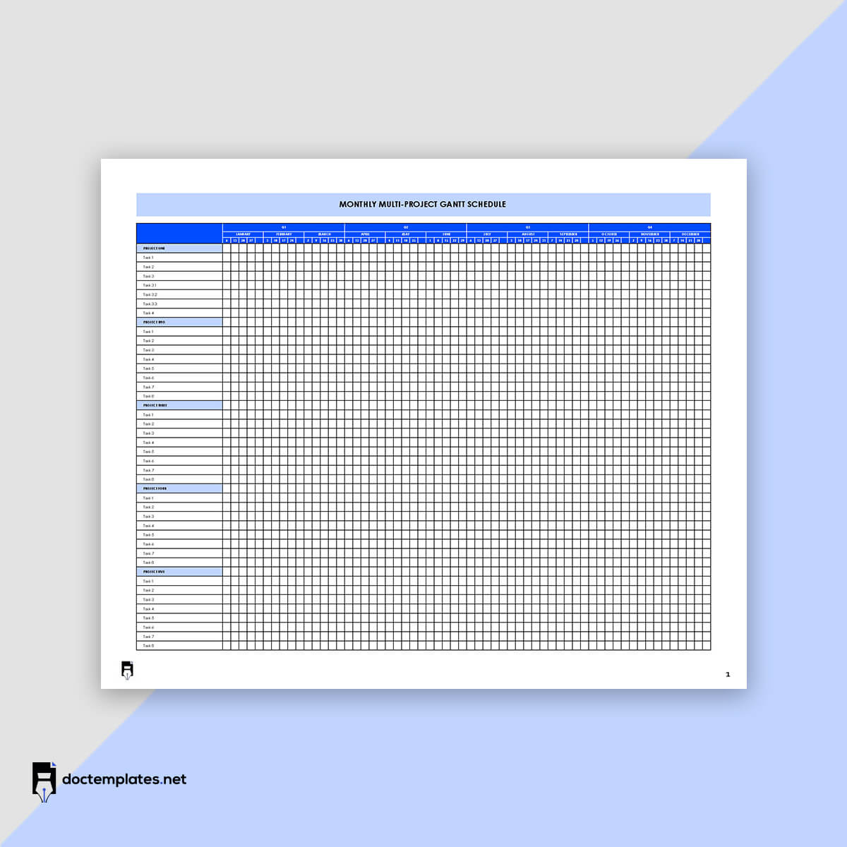
An elaborate and detailed Gantt chart can be time-consuming to create. This makes it necessary to use templates. A sample template for the Gantt chart can help you create professional charts in minutes rather than hours or days. In addition, our readers can access free downloadable templates from our site for their use.
What is a Gantt chart?
A Gantt chart represents the tasks and resources required to complete a job or project concerning time.
It is thus fundamentally used to represent the project schedule. It may include tasks’ start and end dates, durations, dependencies, and milestones; the chart uses horizontal bars whose lengths depict each task’s progress. Other data that can be included in the chart include assignees (team members who have been assigned the project tasks), important dates for events like meetings, approvals or deadlines, project progress, and the entire project schedule (start to finish). The tasks are on the left side, while the project timeline is on the right in the schedule bars. The chart is used for scheduling, assigning priorities, and planning purposes.
Origin
Gantt charts were introduced in project management by Henry Gantt in the early 20th century. The original version of the chart was written on paper, but this, later on, evolved into more advanced charts with the innovation of computers in the 1980s. Later versions were more elaborate, complex, and detailed.
Despite the charts becoming popular in the early 20th century, the evolution of Gantt charts can be traced as early as 1896. In 1896, the first project management chart was introduced by Karol Adamiecki in the form of a Harmonogram, which set precedence for modern Gantt charts. In 1910-1915, Henry Gantt published his project management system, the modern Gantt chart. Later on, in 1931, Adamiecki published the Harmonogram in polish, thus gaining limited exposure.
How Does it Work?
Gantt charts are most commonly used to manage large-scale projects; however, they can be used for any situation where you need a visual representation of the project flow. It uses horizontal bars to represent each task, while the bar lengths represent the time needed to complete the task and jointly illustrate the project timeline. In addition, the tasks can be arranged in the execution sequence, and their durations (with start and end dates) can also be shown.
The chart lets you determine which tasks are completed, in progress, and pending. This way, the team can plan accordingly to ensure the project is completed on time.
Fact check: Tasks are outlined on the vertical axis of the chart. On the other hand, the horizontal length of the bars indicates how long it will take to complete the associated task.
When and Who Can Use a Gantt chart?
Most project managers use Gantt charts to stay organized and track and monitor tasks. As a result, they simplify project management by serving as a roadmap to guide the entire project team, from workers to stakeholders.
When
The chart can be used at different stages of the project life cycle and situations. First, the chart is used during the planning stage in projects where multiple people or teams are involved, and strict deadlines must be met. Second, the chart is used when different teams work on different project parts and need to track and manage their work. Third, you should consider using the chart when there are reliable estimates of task durations.
Also, the chart is suitable for complex projects, for example, projects whose tasks must be completed in a specific order. Lastly, it is used when there is a need to show the entire project timeline visually.
Who
Due to their utility, the charts are often utilized by project managers. However, they can be used by other parties, such as team leaders, project team members, executives, and business owners. In addition, the chart can be utilized in any department in an organization and different industries.
Examples of industries and fields where Gantt charts are used include construction, manufacturing, marketing, consulting agencies, software development, human resources, design, creative industries, and event planning.
Gantt Chart in Waterfall Vs. Agile Planning
Gantt charts can be used in waterfall and agile planning. Waterfall planning is a linear approach to planning a project. It begins with collecting stakeholder and customer expectations at the beginning of the project. Then, a sequential plan is developed detailing the milestones and deadlines that must be met to fulfil the pre-established stakeholders’ and customers’ expectations.
Finally, the chart breaks down the project into manageable tasks such that each step depends on the completion of the preceding step. Waterfall planning is suited for projects such as manufacturing and construction that follow a well-defined process whose steps can be defined in advance.
Unlike the waterfall approach, which is relatively rigid, agile planning is characterized by flexibility and adaptability. Agile planning involves breaking the project into smaller iterations, known as sprints, rather than creating a schedule for the entire project. The team then plans on how to work towards the project goals during the sprint, which is often a two-week duration.
After the sprint, the achievements and developments of the previous sprints are considered to create a plan for the subsequent sprint. In such an approach, Gantt charts are sued to demonstrate how tasks are related and how changes in one task can impact the project plan. This type of planning suits dynamic and unpredictable projects with changing requirements and priorities.
Pros and Cons of a Gantt Chart
Gantt charts have several benefits that make them valuable tools for managing projects. However, they also have their disadvantages.
Pros
The advantages of the charts include the following:
- Easier identification of tasks: The charts are visual and easy to understand. The tasks are laid out in the chart in logical order. This makes it easy to identify tasks that can be undertaken simultaneously and those that must be prioritized over others. This helps identify potential bottlenecks and tasks that might have been missed in the project schedule.
- Determines logistics and task dependencies: The chart makes comparing different tasks easy and shows their relationships. This allows the user to see how one task affects another and thus remain committed to meeting timelines to avoid rescheduling tasks.
- Depicts additional time needed for the project: You can utilize the chart to determine the additional time needed to complete tasks and the cumulative time needed to complete the project without delays. This can be done by identifying critical tasks that must be completed when due and noncritical tasks that can be delayed ensuring the project is completed as scheduled.
- Visualises your project: The chart gives you a start-to-finish overview of all project tasks and their status at a glance through its use of bars, text, symbols, etc. This makes it easier to create project progress reports and provide real-time updates.
- Keeps everyone in harmony: The charts make it easy to keep all team members informed of progress. This is essential, especially during project execution. If one person is not on the same page as the team, delays, bottlenecks, and cost overruns may occur.
- Manages various and comprehensive: The chart can manage small, large, and complex projects. Examples include software development and construction projects such as dams, highways, etc.
- Connects the tasks: You may have to rearrange the tasks when changes or unprecedented events occur. In such situations, the chart helps you connect the tasks based on dependencies without missing a step or losing sight of the project goals.
- Monitors project’s progress: A Gantt chart is an effective tool for measuring a project’s progress as it can be made to record different metrics. Such metrics include milestones, deadlines, etc.
- Promotes transparency: The chart promotes transparency regarding how obligations and responsibilities are distributed between the project team members. The charts show how the tasks are distributed, making everyone aware of each other’s responsibilities. This, in turn, promotes trust and teamwork.
- Creates a sense of accountability: By illustrating the role and responsibilities of each team member, the chart facilitates accountability within the team. This is because the progress of each task can be tracked, and any wins and failures can be documented in the chart. In addition, since the chart also identifies the team member’s responsibility for the specific task, it is easier to hold the team members accountable for the outcome of their assigned tasks.
Cons
Some of the disadvantages of Gantt charts are as follows:
- The charts can be too complex for some people.
- Due to their complexity, people may find it challenging to create, read and update the chart. However, this shortcoming is typically associated with traditional Gantt charts. On the contrary, online charts are known to be more simplified and user-friendly.
Components to Include
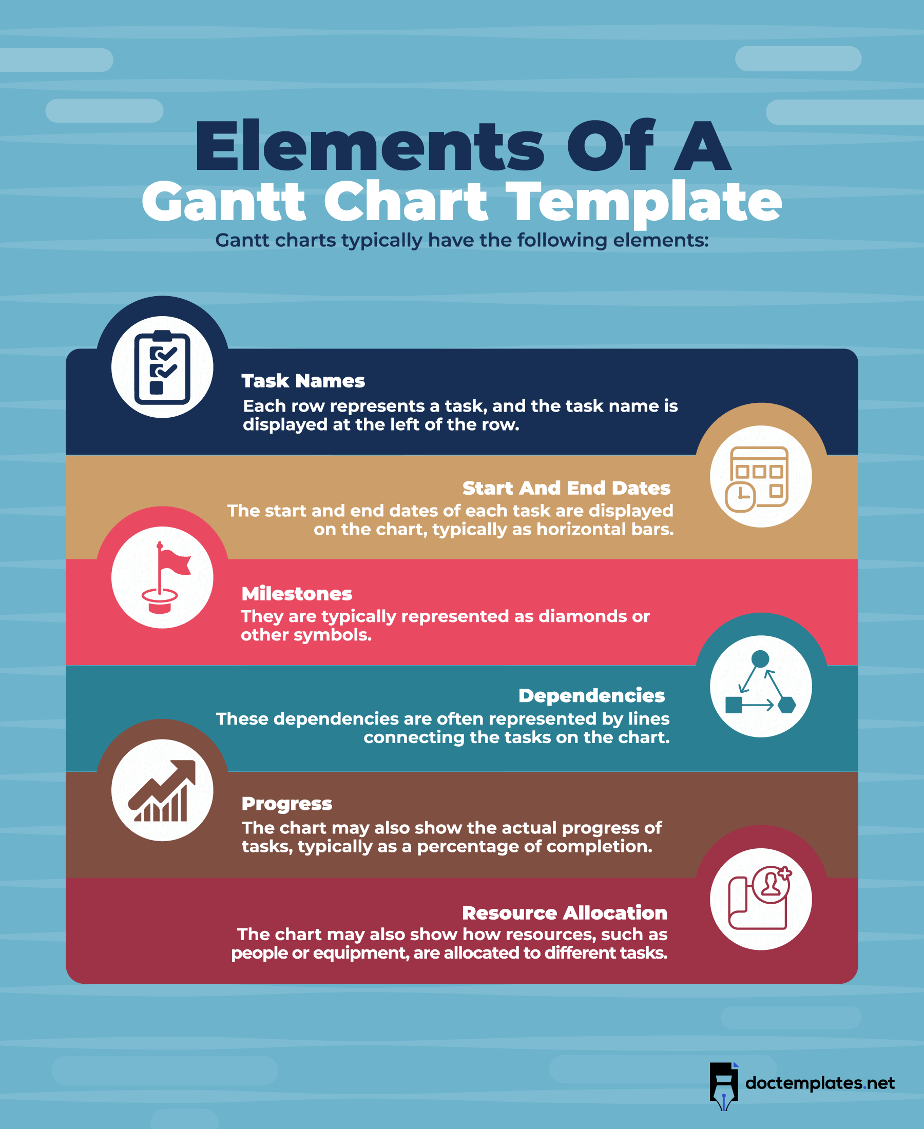
A Gantt is primarily a bar chart showing what needs to be done to provide defined project deliverables on time. This information can vary from project to project based on the project’s nature and the chart’s purpose.
Some of the essential components of Gantt charts are:
Task list
The tasks list itemizes all of the tasks that will be performed. The list vertically runs down on the left side of the chart. The list can be broken into groups and subgroups of closely related tasks.
Timeline
The timeline is an estimation of the project completion time. It is drawn horizontally across the top of the chart. It is represented in days, weeks, months, and years.
Dateline
A dateline is used to indicate the current date on the chart. For example, it can show the day, month, and year.
Bars
The bars show the amount of time needed to complete a task and are drawn horizontally on the right side of the chart. Each bar indicates the task progress and duration, including start and end dates.
Milestones
Milestones are significant achievements and events that take place within the project lifecycle. They can mark stages or completion of different phases in a project. The milestones are represented in the Gantt chart by yellow diamond shapes. Milestones are not tasks but influence the process and timing of tasks and the project.
Dependencies
A dependency means that one task can only be performed if the previous tasks have been completed. Dependencies are represented on the Gantt chart by the light grey lines that connect the interlinked tasks.
Progress
Progress shows how far a team member is from completing a task. Progress is indicated using percentage or bar shading.
Task ID
A task ID is a unique identifier assigned to each task. Each task’s ID is indicated using letters and numbers. This is used to identify which task you refer to on the chart during progress meetings or reporting.
Resource assigned
The chart should indicate the individual or team assigned to complete each task. In addition, the name of the assignee should be spelled out.
How to Make a Gantt Chart in MS Word?
A Gantt chart is a tool that provides both graphical and statistical information about the project’s schedule. It is straightforward to make a Gantt chart in MS word.
Here is a guide to follow when creating the chart:
Create a stacked bar graphic
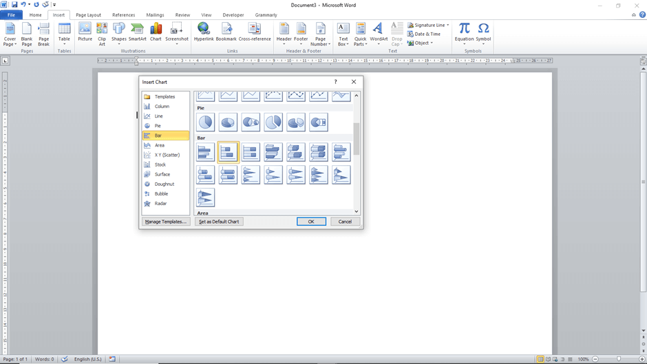
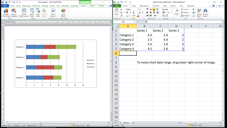
Create a blank document. Then create a stacked bar graphic. Start by setting the page orientation as landscape. Go to “Page Layout,” click on “orientation and select “Landscape.” Then go to “Insert” and click on “Chart.” A list of chart options will appear. Select the “Bar” type of charts, select “Stacked Bar,” and click Ok. A stacked bar chart will be created along with an Excel table.
Add your project schedule information
Next, you need to input your project data in the Excel table. First, identify the project tasks and indicate their respective start, end dates, and duration in days. Then, to add this information to the chart, use the following steps:
- Enter the task names under column A in the Excel table. The first task in the table will appear on the bottom bar in the chart, and the rest will be stacked in that order.
- Next, rename the other columns in the Excel table as follows – Series 1 to start date, Series 2 to end date, and Series 3 to task duration.
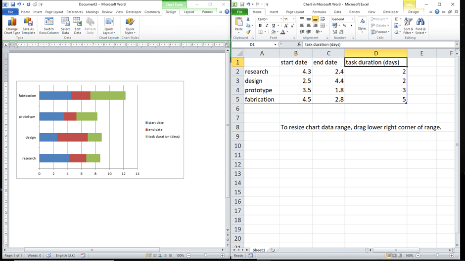
- Then, change the data format in columns B and C in the Excel table to a date format. Select the two columns, right-click them, and select “Format Cells.” A drop-down menu will appear with different data formats, select “Date,” and under “Type,” select the preferred date format.
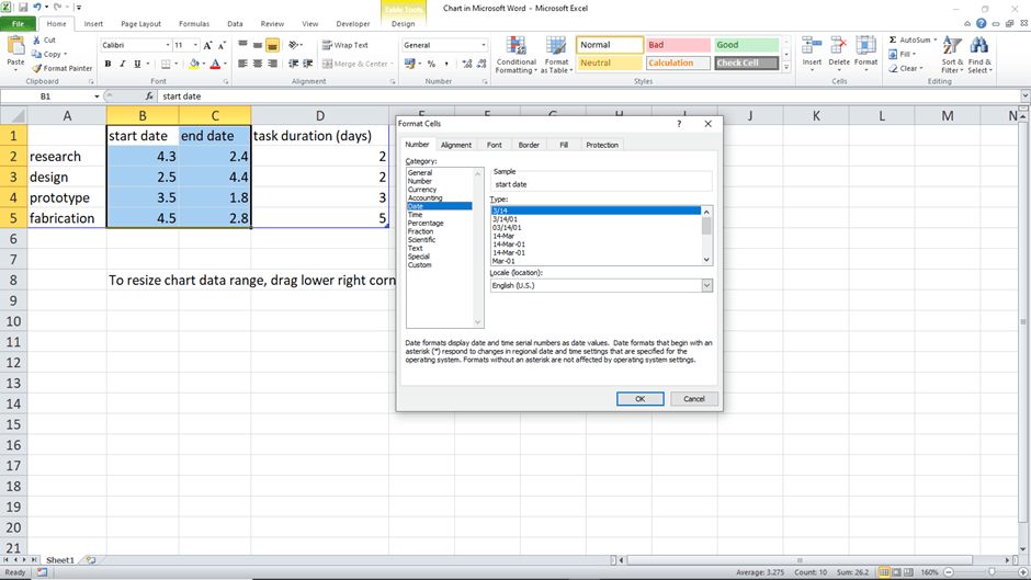
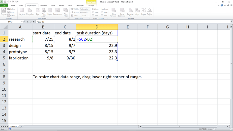
- Once the appropriate date format has been selected, include the start and end dates in the Excel table. Then, to calculate the durations, input the formula =$C2-$B2 in column D2 in the Excel table. Then, select that cell and drag the handle along column D to apply the calculation formula to the other cells.
- Since you have calculated the task durations, you can remove the end date column to make the duration data more visible. Go to the bar chart, select the chart, then go to the “Chart Filters” button. Uncheck the end date selection under the “Series” category and apply.
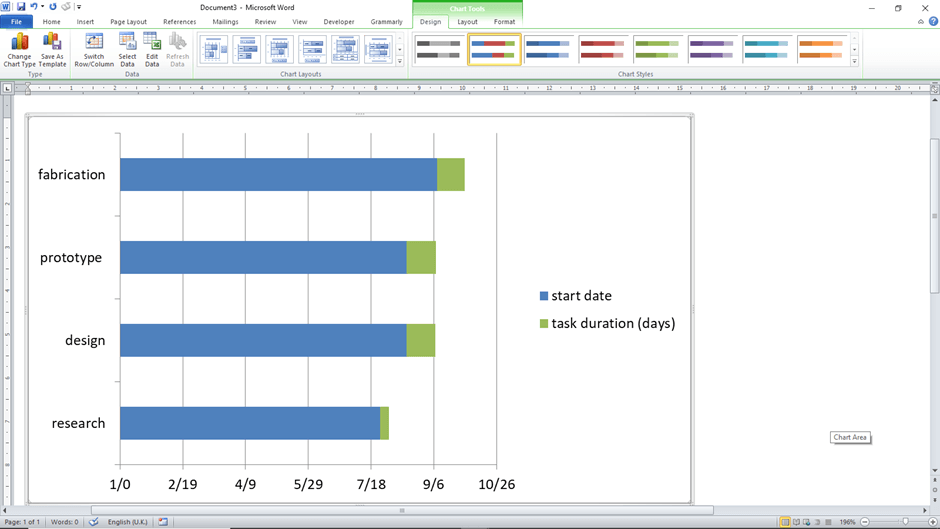
Turn your graphic into a Gantt chart
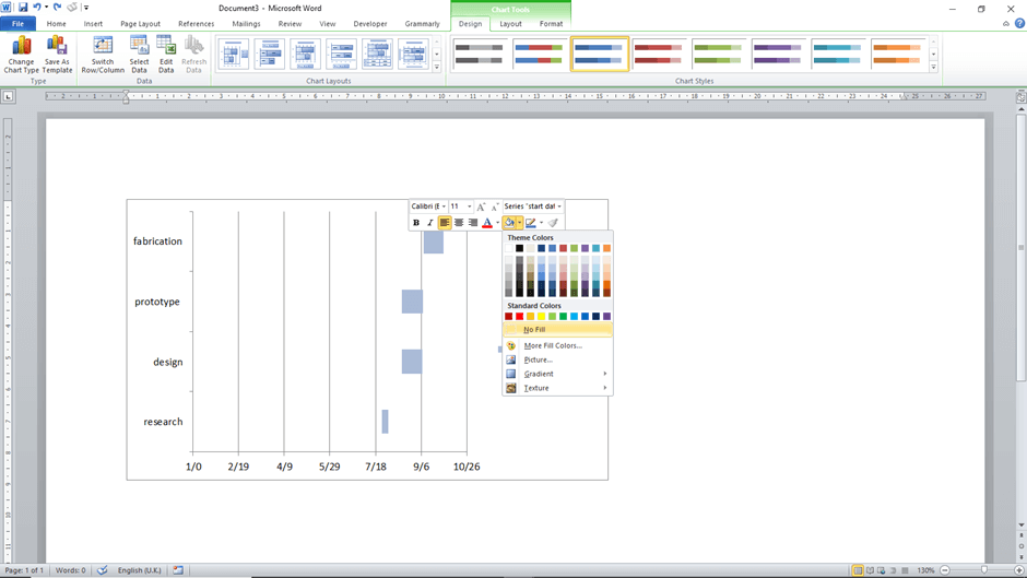
Next, to turn the chart into a Gantt chart, you need to make some modifications that fit the standard principles of the chart. The start date bars should be blue, and the duration bars should be grey. The blue bars should be transparent so that only the grey bars are visible. To do so, right-click on any blue bar, and the entire series will be selected. Then right-click on the selection, and the toolbar will pop up. Click on the “Fill” command and select “No Fill.”
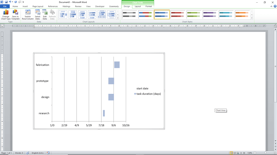
Customise the chart
Afterward, you can customize the chart to make it more presentable. You can personalize different elements of the Gantt chart. For example, you can customize the bars to have an appealing style and other effects, such as shadows, to make them more visible. These customizations can be made under the “Format” command under “Quick style” and “Shape Effects.” Also, you can use different colors for individual tasks whenever you want to emphasis certain phases or activities. Right-click on the taskbar you want to recolour, right-click on it, go “Fill,” and select the preferred color.
If you need to reverse the order of the tasks, double-click the task list. Go to the “Format Axis” and select the “Categories in reverse order” checkbox. Other elements you can modify are the length and width of the bars. You can also remove the legend.
Save the document
Finally, head to “File>Save As” and select the preferred location to save the document on your computer. Then, type the name for your schedule, which can be the project’s name.
Do’s and Don’ts
To ensure you create the most effective and functional Gantt chart for your project, there are things you should consider.
Do’s
They include:
- Breakdown your tasks: You should break down the tasks into manageable actions. The more defined the tasks are, the easier it is to track project progress.
- Add essential details and documents: Ensure to add important information that facilitates reporting to the chart in the notes/comments section. Also, try to add documents that provide more information on how to complete a task.
- Label tasks: The name of each task should reflect the work or activity that goes into that action. So, use the name of the team assigned when labelling tasks.
- Display start and end dates: The start and end date of each task should be displayed clearly to track the progress of your project. This information is crucial for better planning.
- Define project path: When indicating dependencies, use lines to show the following action for each step. The line should stem from the first task to the beginning of the next step. An arrow pointing to the subsequent step should be used to show this workflow and project path.
- Collaborate with team members: Establish clear communication with the team members. Ensure updates are communicated on time and ask for feedback. Share the chart with other stakeholders, including clients, contractors, etc. Also, integrate the chart with other management apps being used in the project.
- Manage team workload: Allocate work to other team members to help each other balance the workload. Do not overwork or overwhelm the team while you can schedule accordingly to avoid such cases.
- Estimate time and effort: Estimation is necessary to determine the duration and the resources needed for each task. This, in turn, is used to estimate the project time and effort, which are critical factors in project planning.
Don’ts
They include:
- Do not skip dependencies: You should always show the dependencies of tasks on each other. This prevents delays and ensures plans are formulated before work begins to retain a smooth workflow.
- Do not assign work to absent team members: Do not assign work to people who are not available. This may delay your project as you will have to wait for them to return and finish the work. So, first, check the team’s schedule outside the project.
- Do not overlook time-offs: When assigning work to your team, ensure to factor in time-offs they will take, such as vacation days and holidays.
- Do not ask for feedback: Do not stop your team and stakeholders from sharing their thoughts, as it will help you correct errors and increase the efficiency of the Gantt chart. Instead, have a team member review the chart and give feedback before sharing the final draft.
Frequently Asked Questions
What Are Gantt Charts Used for?
The chart is a visual project management tool used to illustrate the activities needed to achieve a given goal, for example, a project’s objective. The activities will typically have to be completed in a given amount of time and must work towards completing the project’s objective by the end date. The chart tracks the progress, schedule, and plan for projects and tasks co-occurring in an organization. It also aids in allocating resources to projects and prioritizing essential projects.
Who Was Henry Gantt?
Henry Gantt was a mechanical engineer who introduced Gantt charts during the 1910s. The creation of these charts stemmed from his profession as a social scientist and management consultant. He worked on streamlining and increasing the productivity of workers and corporations, thus leading up to the introduction of the Gantt charts. The charts were meant to help supervisors track the employee’s progress and ensure the schedule is followed.
What Are the key components of a Gantt chart?
A Gantt chart consists of the project tasks list on the y-axis, the horizontal progress bars, and the milestones on the x-axis. In addition, it can include other information such as assignee, task ID, etc.
